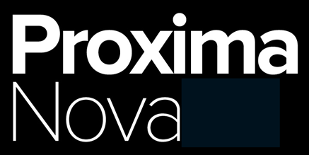
 There’s a good story by on Medium today about Proxima Nova, the font that by many measures has replaced Helvetica as the world’s most popular typeface. Proxima was first drawn by Mark Simonson in 1981, it took a while to gain traction but after the release of Gotham in 2002 it really took off.
Fred Woodward commissioned Hoeffler to create Gotham when he took over as Creative Director at GQ, and very nice it looked too. But I had just taken over Fred’s job as art director of Rolling Stone, and we were looking for a new geometric sans, so after consulting with my art department of Kory Kennedy, Devin Pedzwater and Matthew Ball, I chose Proxima, because it was just…better.
The font manages to feel high-end whilst still delivering outstanding functionality. It really does tick a lot of boxes – cool, modern, personal and fun, but without a prescriptive point of view.
By this, I mean a font that doesn’t look too male, too female, too posh, too serious, too anything, but still holds deep emotional promise. This is the genius of Proxima.
The Medium article rightly makes the case for the lower case ‘a’ being the signature character, the single letter that defines the feeling of the whole font. And compared to Gotham, the Proxima ‘a’ wins hands down.
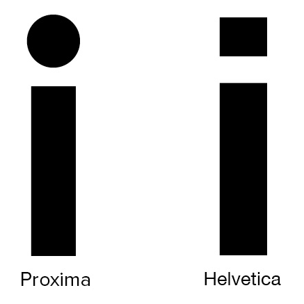
But in the first place, sans fonts are defined by the lowercase ‘i’. This letter can only be drawn in two ways, with either a rounded dot or a square edged dot.
Johnson’s London Underground font is an exception, with a diamond dot, and there are other fonts that have got squares with rounded corners, but you get the general idea here.
Helvetica has a square dot. This makes it strong, practical, manly even.
The alternative to Helvetica used to be Futura, the Bauhaus masterpiece so recently dumped by Ikea in favour of Verdana.
Futura has a round dot on the ‘i’. This makes it friendly, modern and possibly more female. But Futura predates Helvetica. It’s not built for the modern age, it’s got a small x-height and it doesn’t work on screen. What’s more, its ‘i’ dot looks underpowered compared to Proxima‘s
Which is why Proxima is so brilliant. It combines the strength of Helvetica with the feeling of Futura. And it’s the lowercase ‘i’ that proves it.
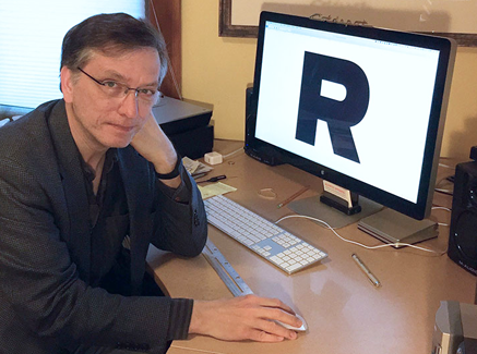 Here’s Mark Simonson at his desk, from a great story by Tamye Riggs on the adobe site about how Mark works, with lots of excellent examples and sketches.
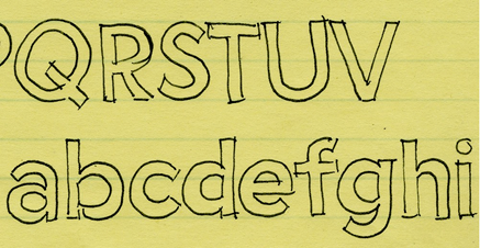 And here is the original 1981 sketch for Proxima, taken from Cameron Moll’s Medium post.
Postscript: Mark Simonson and I exchanged a few messages on twitter after this post was published. In these he generously noted that Rolling Stone’s 2002 adoption of Proxima gave him the motivation to develop Proxima Nova with all the extra weights.