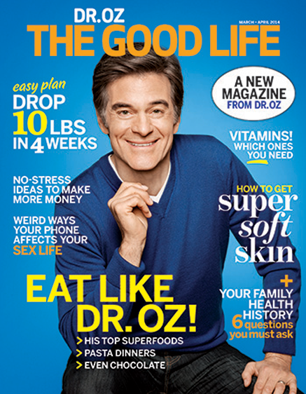
 Dr. Oz is a controversial figure. Billed as ‘America’s Most Trusted Doctor‘ he’s a top-notch heart surgeon, has a huge TV show and a massive social following. Oz has been named one of Esquire’s 75 Most Influential People of the 21st Century, as “the most important and most accomplished celebrity doctor in history.” But he often attracts establishment criticism, not just for advocating alternative therapies, but for his style. As a recent New Yorker profile explains, he employs words that serious scientists shun, like “startling,” “breakthrough,” “radical,” “revolutionary,” and “miracle.”
It’s interesting that the high energy, almost tabloid approach of the TV show is missing from this, the launch issue of his own magazine.
Just published by Hearst in the US, The Good Life could well be the consumer launch of the year. There are 800k copies printed, 325k of them on newsstand, with the rest sent to other Hearst subscribers. In the past few years Dr. Oz has been a huge seller of magazine covers, not least through the patronage of Oprah and O magazine, so it makes sense that Hearst would want to give him his own masthead.
But like the good Doctor himself, it’s a controversial cover, drawing criticism from many, not least Bob Newman, making a welcome return writing at foliomag.com. He says “It looks more like a low-budget, one-shot newsstand special rather than the exciting debut of a powerful new media entry”
Bob makes the point that the whole thing appears undercooked, with no distinction to the logo and nothing special about the image. It feels like a prototype, rather than the finished article.
In many ways he’s absolutely right, there’s no way this art direction can be sustained on a regular basis. Unless they change the colours (more on that later), every issue is going to look the same. But delving a little deeper, I do believe there’s method in this madness.
With everyone quite rightly working on multiplatform delivery, native advertising and all the rest of it, newsstand cover science is often overlooked. But when there’s money to be made, the difference between success and failure is often down to really grasping the emotional truth of your brand, and then doing simple things very well indeed.
Aside from his telegenic good looks, the fundamental appeal of Dr. Oz is of a medical authority delivering easy ways to look younger and live longer. Unlike Oprah, who has a fully rounded emotional, cultural and political agenda, Dr. Oz’s appeal is way more narrow. It’s about the avoidance of weight gain, illness and premature death.
This is a paradoxical sell. Anti-aging, weight loss tips and nutritional advice is genuinely appealing, but it needs a large dose of twinkly eyed, v-necked charm to get past the fact that this new magazine is a form of life insurance.
I believe that’s why the coverlines are so totally bland. They’re attainable but not challenging, calm, comfortable, expected even. The exception is the mobile phone line, which is just the safe side of edgy; intriguing, but way short of the full Tinder. The logo itself is visually underwhelming, but in turn this makes the promise feel like a coverline in its own right.
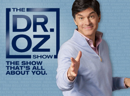 And Dr. Oz already has a logo for his TV show. The blurb for which is that it’s “all about YOU”. Clearly, that’s not entirely true, but it does point to why the magazine needs to reflect that benefit, rather than just promote the Dr. Oz brand.
There are no prizes for deducing that the reader is pretty much Women Everywhere. But after that there’s no attempt to segment any further. There’s nothing on this cover which could suggest that “it’s not for me”. Even the colour palette has been engineered to be as inclusive as possible.
The blue background was described in Adweek as a gender neutral decision by Dr. Oz, although he then complicates this assertion by saying that (the colour) “puts a little testosterone in the message”. I can’t see that, I think it’s more a straightforward case of best newsstand practice. Blue recedes, allowing the hot colours to pop. If the logo were pink, no amount of blue in the world would make it gender neutral.
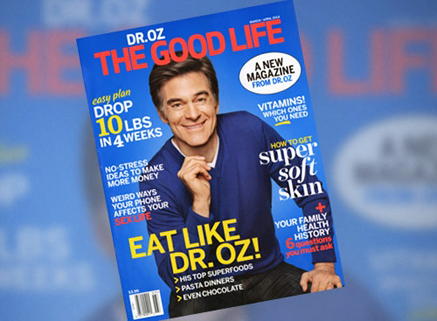 Eagle eyed observers will have noticed that in the pre-launch coverage the logo was red, but on the actual magazine it had been changed to a bright orange. This last minute change will have been made to avoid colour ‘vibration’ and deliver maximum newsstand standout. But while they were at it, I wish they’d dropped the black outline off the white ellipse. The black text within is cool and unemotional, which it’s perfectly entitled to be, but the black outline is superfluous. It muddies the message and breaks the aesthetic.
The design is simultaneously both ancient and modern. With no drop shadows and lots of space between the lines, it feels traditionally typeset. Equally, given that Jony Ive has now decreed the world to be flat, it looks almost as contemporary as iOS7 and Flipboard.
Dr. Oz’s face is small, but that helps make this cover all about the lines. They really do float above the picture, making it clear Dr. Oz is behind these benefits, rather than in front of them.
At the end of the day, this title is still a pilot. According to recent reports, both the art director and photo director have already been replaced, with a new team working on the second issue. They may well maintain this cover design, albeit with a different colourway, but if Hearst decide to carry on, bigger changes will need to be made. Given how controlling Dr. Oz is of his brand, that will depend on what he wants. Speaking to Adweek, Dr. Oz says “I’ll do what needs to be done to help the magazine appeal to people…If I need to be on every cover, I will be.”
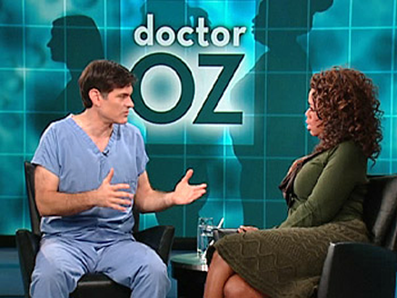 This is when The Good Life will have to make up its mind as what sort of magazine brand it’s going to be. Thus far, Dr. Oz has a pretty limited wardrobe. On TV he appears in either blue scrubs, blue suits or blue shirts. Here he is on Oprah’s show, wearing what is essentially a uniform.
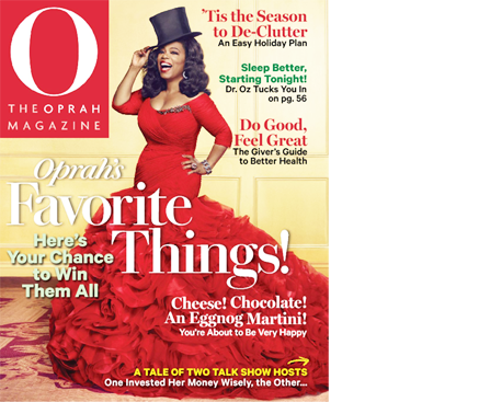 Unlike Oprah, he’s not going to be rocking a fashion moment any time soon. Here’s a recent issue showing the lengths she’s prepared to go to in the interests of newsstand sales. (Note the Dr. Oz sleep coverline top right).
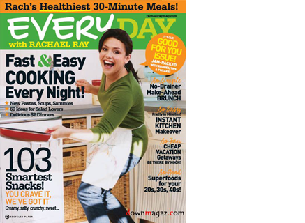 Likewise, goofing around in the kitchen as seen on Everyday with Rachael Ray is unlikely to suit a word class heart surgeon.
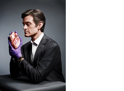 Nor will a high concept approach work either, as this scarily entertaining image from his New Yorker profile demonstrates.
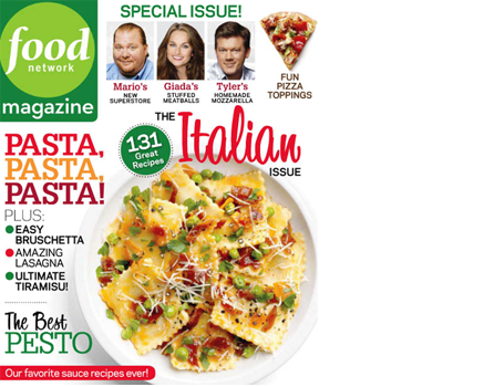 Given Hearst’s massive success with Food Network Magazine, another route could be to use a smaller picture of Dr. Oz holding the corner, with a big lifestyle image hung underneath to carry the lines. But exactly which image is the $64,000 question. A nice picture of ravioli might sell copies, but food is not Dr. Oz’s whole story, and depending on execution risks the title moving out of category.
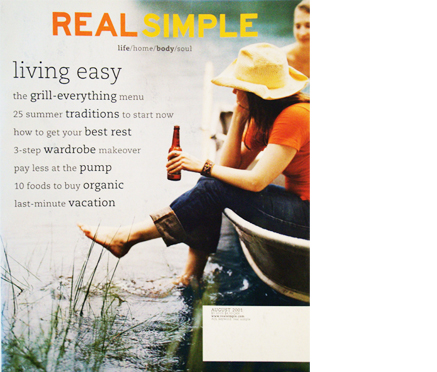 Attempts to literally visualise a reader’s ‘healthy lifestyle’ have been tried before, notably by Real Simple in their first few issues after launch. But that approach tanked badly, requiring the title to move into more symbolic images of storage, candles and lots of food to get the brand’s promise visualised in a way that works.
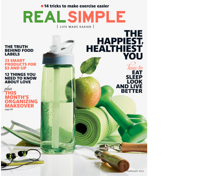 But aside from having a very different set of benefits, Real Simple does not hold a universal appeal, it’s niche and it’s ABC1. Unlike Dr. Oz, it’s not for everyone.
Assuming the pilot works, and I firmly believe that it will, where does the title go from here?
It’s possible that Dr. Oz will choose to develop out his personal style. With the right stylist and plenty of conviction, this route may work, but the range of options is never going to be great, and moving out of uniform risks changing the Dr. Oz brand.
I believe the answer lies elsewhere. There’s a long way to go and I’m sure many focus groups to work through, but Hearst still have some big questions to answer.