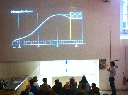
 The guy standing in the bottom right of this picture is Francesco Franchi, the Art Director of Italy’s much admired Il magazine. Fresh from his triumph at the SPD awards in New York City, Francesco was speaking last night at the EDO. Introduced by Mark Porter, this packed event took place inside the impossibly hip environs of Mother, in London’s Shoreditch.
Il is noted for extensive use of stunning infographics, as well as fine typography and powerful layout. Have a look at magculture‘s recent post on the work to get a feel for it. As you might expect, Francesco’s presentation was like one great big infographic. And really good it was too, with a highly refined visual narrative to explain the work he’s done and how he did it. There was insane attention to detail, underpinned by a very strong grasp of form and function.
But what about his chart that shows infographics peaking sometime last year? And the mysterious shaded box in the top right of the picture, with a caption that reads: “what next?”
I’ve already posted about the potential for infographics as a content marketing tool. But what I think is actually going to occupy the top part of Francesco’s diagram is THIS.
Well, not exactly this, the opening credits to Catch Me If You Can, but animated infographics. Tablet designs that move, with as much reference to Saul Bass‘s amazing title sequences, and Maurice Binder‘s work on James Bond as anything we have yet seen in print.
So how do I go about making that then?!