 This post was first published on The Media Briefing earlier this week.
Buzzfeed is now considered one of the world’s most innovative news organisation. It’s value is currently over $1b, getting close to the likes of The New York Times ($1.28b), and dwarfing other digital news sites. So it’s no surprise that more start-ups are wanting a slice of the pie.
American news site Vox is early out of the blocks, launched just three months after founder Ezra Klein left the Washington Post. He claims that Vox will ‘Explain the world’ but the site is already creating a stir, as evidenced by last weeks rant from a senior Facebook executive complaining that ‘Someone should fix this shit’
He was referring to Vox’s story about how you should ‘Wash your jeans instead of freezing them’, with the complaint was that they were not delivering ‘A new home for serious journalism in a format that felt Internet-native’.
When it comes to content, you have to make your intentions very clear. Which is why design is central to a users understanding of what to expect. Can Vox persuade readers that it’s a real heavyweight political commentator? Can Buzzfeed change horses midstream and let us believe that they too should be taken seriously?
In short, what does the design of these two sites say about trust?
The logo fonts are fundamentally different. Buzzfeed’s is a functional sans, with an almost child-like feel created by the big lowercase ‘ee’. By contrast, Vox’s serif ‘V’ on their twitter icon is huge, and when spelt out has a sophisticated flourish. It feels high end, a bit like The Atlantic, redesigned by Pentagram not so long ago.
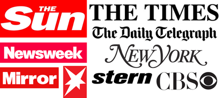 Likewise the colour means very different things. Not for nothing are serious newspaper logos black, and tabloids white out of red blocks. This visual language is impossible to deny: red means urgency, black is just inert. It has no opinion. (Although Stern have managed to have their cake and eat). But what does yellow mean in this equation?
Buzzfeed has built both traffic and reputation on spectacular viral techniques, listicles, cat videos, engaging headlines and their killer franchise, the online quiz, proving that content most people are interested in are stories about themselves.
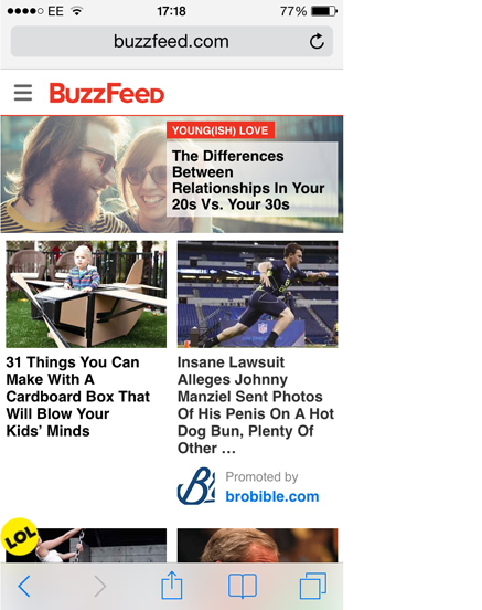
But now they now want to do serious journalism. Reuters reports that they have boots on the ground in Ukraine, are publishing in-depth articles on Chinese dissenters and have had some big, breakout stories. But can Buzzfeed ever be regarded as a serious news site, when their key visual signature looks like this…
![]() Or more precisely, LOL, in black type within a yellow circle.
Or more precisely, LOL, in black type within a yellow circle.
The use of yellow has vexed media designers ever since CMYK was invented. It’s the brightest colour, but has the lowest tonal value, which means it has the highest level of visual cut-through.
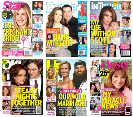 Nowhere is this more apparent than on a magazine newsstand, where yellow is the number one technique for getting a headline to stand out. For some brands, relying on yellow can cause real problems, as illustrated by the case of People, the world’s biggest and most profitable magazine brand. It costs a dollar more than most rivals, but because the whole category rely on yellow headlines, People looks cheap by association.
Moreover, in the world at large, yellow is often used to deliver marketing messages and price tags, which has taught us that when we see yellow, we’re being sold to.
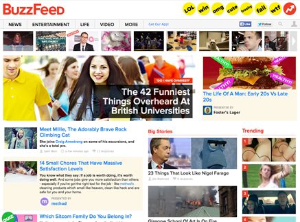 It all comes down to how it’s used. Like a celebrity news magazine, Buzzfeed, use bright yellow to draw our attention to comments, or small pieces of content that we may otherwise overlook.
It’s effective, but combined with a red logo, lemon tint panels and bright blue headlines, the combination of these colours creates a tabloid environment more akin to a Screwfix catalogue, than a premium destination for serious journalism.
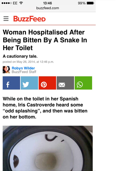 Although to be fair, at the far more important mobile article level, the presentation is cooler, with the colour focused on social sharing buttons.
 Vox have taken a different tack. By making yellow the only colour, they’ve managed to retain it’s effectiveness, but without tarnishing it’s delivery. This is exactly what Grazia did in the magazine market. By using no colour other than yellow, the pallette looked like a fashion statement, and made the rest of the weekly market’s use of red obsolete overnight.
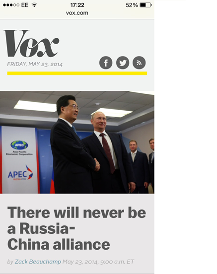
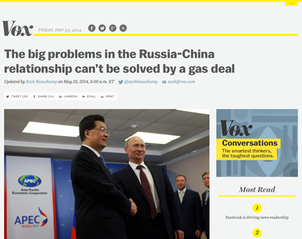 Vox then go further by teaming yellow with grey, delivering a sense of sober authority. And in an unexpected twist, instead of black headlines, Vox use a very dark grey. When I first saw this in the ‘V’ of their twitter icon, I though it was an error, but this approach is consistently deployed in many places all through the site, particularly on mobile. The content can look pale and washed out, but it does prevent the words looking like sales messages.
 Links are understated too, with a cool grey-blue, as opposed to Buzzfeed’s more eye-popping style.
Typographically, Vox has a cultured approach to their content. As any fule kno, there are only two fonts in the world, plain and fancy. Vox use both, with italic serif call-outs, traditional gothic headlines and modern sans text fonts. The feeling is sophisticated, although the small sizes create a somewhat pale reading experience.
Buzzfeed’s headlines and text are primarily in the highly legible and good-looking Proxima Nova. But with bits of Helvetica and other random fonts creeping in, there is a slight low-fi feeling and a lack of brand consistency.
Like Buzzfeed, Vox’s appeal is driven by virality of the headlines. Here’s a super-snarky story from Forbes, attempting to dismantle the thinking behind headlines such as ‘The Simpsons predicted the Ukraine crisis back in 1998’
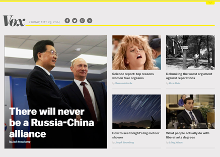 But Vox are also using content curation as a way of building a content mix, as this homepage shows. Here, they pair a super-dull Russia and China story (good for credibility) alongside an orgasm story (good for clicks). Overall, I sense the desire to have a slice of Vice’s now very substantial content marketing pie.
 By comparison, even on mobile Buzzfeed go flat out for volume. Everything’s turned up to eleven, all of it looks fun, but there’s not a serious item in sight. And in the American style, deploy the hyped up tone of capping up every word in a headline: ‘A Naked Woman Has Made The Alphabet Out Of Human Hair’
Vox use a more measured upper and lower-case European approach: ‘How conspiracy theories explain political parties’. This typographic technique has less urgency, but a lot more conversational intimacy. And would certainly be preferred by Buzzfeed’s UK editors.
Overall, the Vox design direction is somewhat dull. But it’s undeniably modern, with yellow keeping the site just inside the pop culture canon. From a business point of view, they have set out to claim the journalistic high ground, and go viral from there. Buzzfeed are attempting world domination the other way round, by taking the lowland masses first, and then attempting to scale the higher peaks.
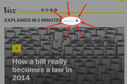
Like Buzzfeed, Vox’s business model is based on ‘native advertising’ or any other term used to describe ads that look like a bit like editorial. However, unlike Buzzfeed, it’s really hard to see which posts are ‘sponsored’, and which are not.
Political authority and influence may be the motivation behind the site, but aside from the click-bait headlines it’s hard to detect any real sense of tone in the content.
Unlike established news sites, I don’t yet know what Vox believe in, other than an enthusiasm for Obama Care. We may be conditioned to it, but when it comes to politics, readers need to know what the brand believes in order to work out the true colour behind the journalism.
This is a problem Buzzfeed just don’t have. What you see really is what you get. It’s not pretending to be cool, there’s no attempt to seduce with the presentation. Which makes me trust them all the more.