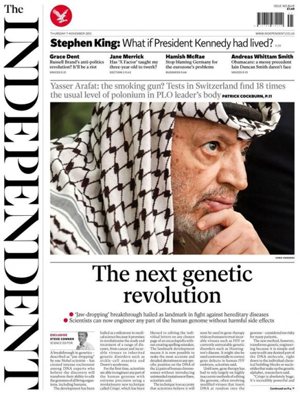
 This is the fifth redesign in as many years, which suggests Last Chance Saloon is not too far away. But here at coverthink we live in The Now, so let’s not worry about that, and just look at the work. The website has been redesigned alongside the paper, and there are interesting plans to introduce a new tablet app, but overall there appears to be no big change to the marketing of the brand. So I’m guessing the four redesign KPI’s are as follows:
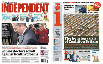 1. Differentiate the paper against ‘i’, the Independent’s cheaper tabloid cousin.
This picture shows the previous confusion between the two, with both carrying red in the masthead. The new design has undoubtably separated the two products, primarily through making the logo a black serif and putting it on its side. Magazine logos have been seen like this (The Face circa 1990) and I’m sure there will be European papers pulling this stroke too, but it’s not been seen on a British paper before.
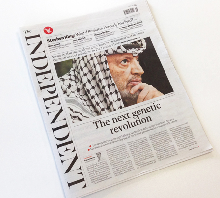 Under normal circumstances, I hate type on it’s side. But in this instance I have real sympathy to the approach. Independent is a very long word, so this way the logo remains BIG and the remaining space is cut into a different sort of shape.
But with no logo at the top, the key is to put stuff in its place that genuinely expresses the brand essence. It can be content or marketing, but it has to really rock.
The top of the paper starts with a band of white space (including barcode and red eagle), signalling its ‘magaziney’ intentions. But this illumination means nothing if the content beneath doesn’t repay the investment.
On this cover the opportunity has been missed. The words are underwhelming, the type is small and there is no hierarchy within this critical part of the page. Which is frustrating, as some of the content is strong and highly ‘ownable’.
The second difficulty the new logo creates is how to divide the page. On a normal width, this can be done vertically, like the Daily Mail and Express; splash on the left, picture story on the right.
But with the new Indy, the narrow page means the picture story is presented over the splash. This profoundly diminishes the headlines’ importance, as well as suggesting the picture story is somehow part of it. All in all, it makes the paper feel more like a monthy review rather than a crusading, urgent and compulsive daily purchase.
 2. Sell more ads.
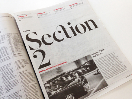
This might work, as the paper looks more sophisticated. There’s a nice use of white space, elegant typography, and a sense of restraint all round. Regular advertising is going to stand out better. But as far as I can see, the increasing shift of clients money into content marketing has not been addressed.
 3. Improve reader satisfaction
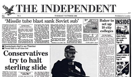
I loved the Independent when it launched in 1986, and so did many others. As the current editor Amol Rajan said this week, “It was radically different, politically neutral, with huge pictures and real gusto.” This is the top of the first issue, taken from the Indy’s own cover gallery. But in recent years it has struggled to maintain a clear editorial direction compared to the clarity of the Guardian, Telegraph and Times. Whether due to failure of editorial or creative direction is neither here nor there, a redesign is always an opportunity to have a fresh start.
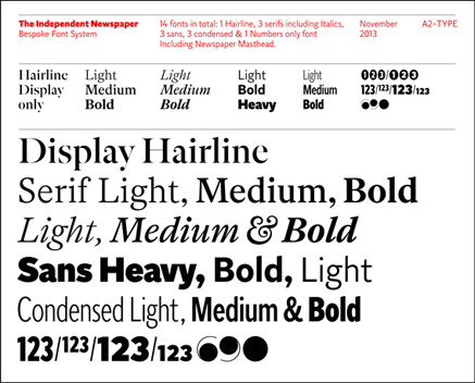 The new look has been led by Matt Wiley, a well respected magazine designer, responsible for the upmarket men’s magazine Port, along with plenty of other good work.
A full set of original fonts have been cut especially for the paper. They’re really good new typefaces, and give a great opportunity for the Indy to deliver content in its own voice. There’s an excellent overview in Creative Review, taking us through the design in fine detail, along with many images of the type in action.
But for all the beauty of the type, some of it is just too small to be easily legible. Readers have complained, obliging Amol Rajan to say that he has taken these comments on board and ‘asked the designers to address them urgently’.
Roy Greenslade, writing in the Guardian, applauds the team for the redesign, appreciating the “commitment to essay-writing as distinct from news busy-ness”. But he also points to the weakness of placing the editorial on page two, as well as other flatplan adjustments. Overall, he suggests readers will more baffled more than anything else.
For me, I have mixed feelings. I’ve bought the paper three times in three days, having not picked up a copy for years. I’ve read it, and I’ve enjoyed it.
But for all the boldness of the new logo, they just haven’t gone far enough. If the Independent’s owner, Evgeny Lebedev, can describe his paper as having “a proud record of innovation”, he should have put his money where his mouth is and done this:
a) Make the splash headline really tell the story. A few more words would deliver real newsstand cut-through, as well as allowing the line to be replicated and owned across all the digital platforms.
b) Properly visualise the splash. Use an infographic, a powerful picture or a typographic solution. Make the whole cover an image that people will want to share, to establish the idea of the front page as an event, as opposed to a template.
c) Put less copy in the paper, make the type bigger, and let stories run longer online. That way, browsing the paper will be a more pleasurable experience, as well as letting the print serve to market the digital platform.
d) Move the horizontal ad position off page three onto page two. As it stands, the paper comes to a grinding halt before it’s even begun.
 4. Stabilise newsstand circulation
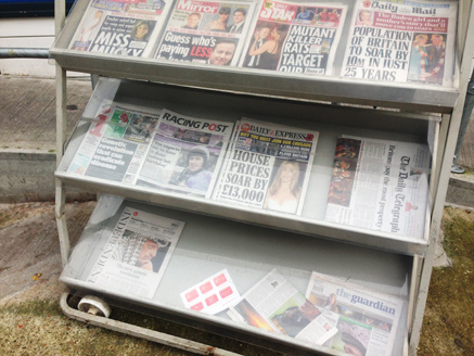
As always, this is the only KPI editors and owners really care about. Here’s the petrol station in Hackney where I bought my issue last Thursday. Given the current landscape, you’d be a brave man to think that a redesign alone will shift more copies. The fact of the matter, is that paid-for media brands now have to work incredibly hard to stimulate demand. This requires great content, a powerful brand filter and a sophisticated marketing operation. Daily newspapers must set the agenda, and get talked about across every platform.
There’s an interview with Editor Amol Rajan in Media Week, where he talks a good talk about his hopes for the redesign. Media week says: “By recalling the spirit of its founders, Rajan hopes to reinforce the paper’s Enlightenment values and strike a chord in what he considers to be an increasingly ‘sceptical but engaged’ age”
But the line that caught my eye was: “There are maybe a dozen areas we can do absolutely better than everybody else”.
Like all the other serious broadsheets, The Independent covers just about everything. so communicating this brand’s point of difference is absolutely essential in letting the reader know why they are buying it. The primary task of a redesign like this is to focus the readers attention on the things that really matter, but for me this is where it falls down. The design is too polite, and the editorial direction not ruthless enough.
Add that to the lack of newsstand cut through, and I can’t see this redesign making any significant difference to copy sales any time soon. I really hope I’m wrong.