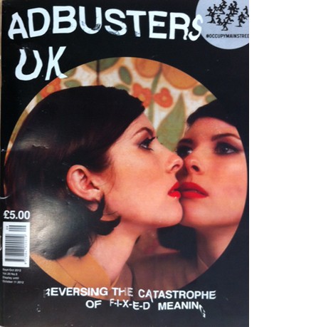
 I bought the latest issue of Adbusters last week in the Serpentine Gallery for a fiver. Unusually for them, the cover was weak (more on that later), some of the content totally impenetrable (more on THAT later) and then there was this spread.
Featuring a quote from former US President George W. Bush opposite Pauline Cutler’s picture of an African child on a pipeline, it’s one of the most moving pieces of editorial I’ve seen in a long time. In a second, it caused me to think, think again, and then vow to take action. But what action? How should Adbusters magazine direct my anger and motivation?
Adbusters was set up in Vancouver in 1989. It describes itself as: “A global network of artists, activists, writers, pranksters, students, educators and entrepreneurs who want to advance the new social activist movement of the information age.”
One of the more visible aspects to the organisation is the magazine. There are no real ads, only spoofs, and it remains a freewheeling piece of work, with no particular internal structure that I can make out. At its best, it feels a bit like Colors magazine at its best, which is praise indeed. So why am I so frustrated?
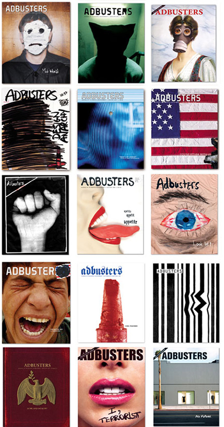
 We’ll start with this issue’s cover. As you can see, it may look pretty, but makes no sense to me, or I’m sure anyone else within a 5 second newsstand purchase window. But Adbusters magazine has a world class track record on covers (see below), so we can forgive them an occasional dud.
 I’m not sure about credits for all these stunning pieces, but Unit 9 seems to have done a good few of them. Coverjunkie has a fine gallery of recent covers, with plenty of others elsewhere online.
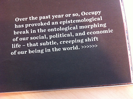
No, the thing I am cranky about is the writing in the darned thing. The current issue has a lengthy story about Occupy, of which Adbusters, having started the whole thing off, is the patron saint. It’s a scholarly text with some good observations on ‘The enigma of revolt’, but boy, is it a tough read.
 This is the sell. After which I defy any mortal to continue reading who doesn’t have a dictionary to hand.
Adbusters own Wikipedia page, says this: ‘The magazine aims to provoke anti-consumerist epiphanies. By juxtaposing text and images, the magazine creates a means of raising awareness and getting its message out to people that is both aesthetically pleasing and entertaining’.
That’s what the spread at the top of this post does so well. But aside from the visual panache, the magazine does need to deliver something more substantial, something with some direction on what action to take now, aside from just pitching a tent.
Long form journalism is still a fine way to deliver the arguments. Ideas that will get us to change our minds, and to change our ways. Abusters magazine looks amazing, but for a text that really works, read this profoundly moving article in Rolling Stone about Global Warming’s Terrifying New Math. Now, if only we could join the two brands together…