September issues are a big deal for any fashion magazine, none more so than for US Glamour, Condé Nast’s most profitable newsstand title. But new figures released this week show the title to be 28% down year-on-year, so the stakes couldn’t be higher, particularly since Anna Wintour was named Artistic Director for all Condé Nast titles earlier this year.
Let’s be clear, the reason why sales are so rubbish is all to do with change in audience behaviour, not because the work is no good. It doesn’t matter how hot your cover is if no-one is standing in front of it. This means it’s critical to find new ways to market the benefits of print, along with maximising other revenue streams.
With Glamour, one big way of balancing the books is through ad revenue. So how is the design of the title changing to that agenda, and where does it leave their relationship with both the industry and the readers?
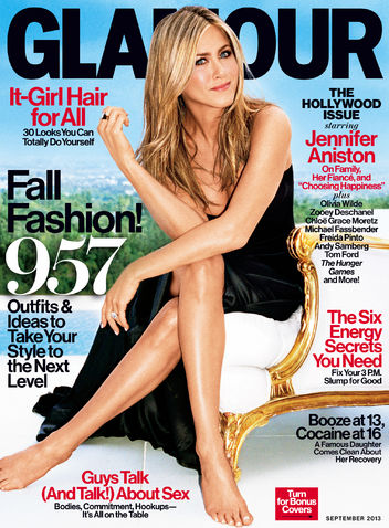
Access is everything. It’s the biggest issue of the year, so you have to have Jen, still the biggest newsstand star. The picture is incredible. Beautifully composed, amazing light, great styling, smart props, enviable location. When seen on Facebook or any other digital platform where potential readers will first encounter the work, it’s perfect.
Print is demanding. When you actually see the magazine, there’s a considerable amount of grain in the cover photo creating a very noticable effect. For some Twitter users this caused genuine disappointment when they saw the real thing. More critical is whether the grain has any impact at newsstand, I certainly saw it before I bought my copy.
Eye contact really means something. However ace the cover is, eye contact is where the relationship with the reader begins. And this takes place in a tiny area of the image. If excessive grain makes this contact diffused, all sorts of questions occur. Has the picture been retouched? Is the picture original? Was the image ever intended to be a cover? In short, are the readers being shown the truth?
Don’t piss off the talent. The whole set has the same grain, yet the photographer Alexei Hay is hardly a beginner. In fact he’s built up an exceptional list of celebrity clients. So I must assume this grain is a deliberate choice. It’s a super flattering technique, but possibly of greater benefit to the star than the reader. Jen’s an amazing looking woman, as a recent selfie proves. But she’s also pushing on a bit, so the risks of being seen to be less than perfect are perhaps still too high for the brand to carry.
Craft still matters. Creative Director Geraldine Hessler is a true master of this kind of work, so there’s much to admire. She manages the newsstand paradox perfectly. Great type, yet loads of lines, lots of color yet a cool black logo. My only quibble is that as this is a special Hollywood issue, centering that line alone does not communicate this ‘specialness’ at all.
Make all the ads look good. I haven’t seen the US version for quite a while, so I’ve missed the change to Helvetica throughout the book, all the way up to and including the cover. This is easily my favourite font of all time, witness the Coverthink logo.
In Glamour, all the pages look terrific. But more than that, the ruthless typographic discipline creates outstanding relationships between editorial and ads, as the content looks well branded, yet neutral. Which is of course, Helvetica’s dark secret. If there is a problem, it’s that many of the sections look very similar, the whole mag can feel one paced. But hey, if it flatters the client…
Make it look like Vogue. What Editor-In-Chief Cindi Leive thinks of Anna Wintour now being on her masthead is anyone’s guess. And I don’t know if the recent design changes pre-date her arrival or are pre-emptive moves. But the fact remains that the mag is now red and black throughout. This is a HUGE move. It’s much more fashion, a lot older, and a lot more premium. Again, it helps with the ads, as many of the editorial pages are now entirely monochrome.
The upshot is, Glamour now looks an awful lot like Vogue.
Make it look even more like Vogue. Helevtica’s great, but it needs a foil. So just to make sure, Glamour now sports a smart new serif. It’s not Vogue‘s Didot, but it sure is a pretty close cousin.
Understanding brand values is everything. Like all general interest women’s magazine brands, Glamour has an overarching dilemma. When you cover a bit of everything (fashion, features, sex, real life, etc), how can you truly define yourself when content won’t do the job for you. This is where tone, both visual and written, is absolutely key.
Tone is the fastest and deepest way of establishing who the reader really is. And this is where Glamour is running the greatest risks. If she were your best friend (and many women’s mags like to make this claim) is she still the clever, sassy and friendly girl you used to know?
Or, has she dropped two dress sizes, become really hip and a little less approachable?
I have always held the view that Condé Nast has only ever been about one brand, Vogue. And that every other title they publish has a substantial amount of Vogue in their DNA. This is no bad thing of course, but given the bun fight we’re all involved with now, it’ll be interesting to see how Cindi Leive keeps hold of her hat.
(Full disclosure: I was Creative Director of Mademoiselle, US Glamour’s now closed sister title, back in 2001)