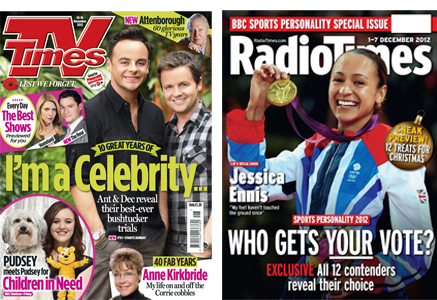
 Here are a pair of excellent covers from two of Britain’s biggest and best-read magazines. TV Times and Radio Times are part of the very fabric of British cultural life. Until TV listings were de-regulated back in 1991, these titles were the only way of finding out what was on the telly that week. You had to buy them, as result they were licences to print money.
Both have storied histories, with Radio Times in particular subject to all sorts of analysis and opinion. Mike Dempsey’s ranty blog post of last year gives a fair taste of that, more so the equally assertive comments. But what does their cover design and execution say about the brands today?
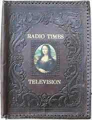 From the outset, Radio Times only published BBC listings, and TV Times only published ITV listings. Even though this stopped 20 years ago, some people in research groups will tell you this is still the case, so deeply was this pattern ingrained into the British psyche. Who can forget the leather binders, lovingly holding both titles, gateways to evenings of ‘family viewing pleasure’.
Today, even though both titles appear to be covering similar content in similar ways, the differences between them are still informed by this history. Not to mention the fact that until last year, Radio Times was owned and published by the BBC. They still have all the access to BBC content, whereas TV Times is still associated with its ITV heritage, although now owned by IPC Media.
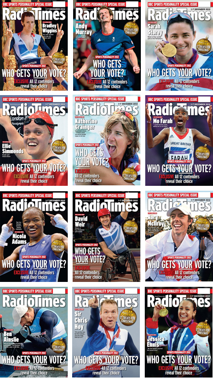 But access counts for nothing if you don’t know what to do with it. This, last week’s cover on the BBC Sport personality of the year, is just an excellent piece of work.
There are twelve covers, each with the same promise, but a different nominee. Unusually for Radio Times, the pictures are not their own, but as a definitive set, it’s a great piece of research. I rarely like questions as headlines, but on this occasion, as it’s talking to the 12 covers set, it really works. By placing the reader at the very heart of the cover, they effectively own the event.
For me, the best bit is the promise that inside you’ll read who the 12 personalities themselves would vote for. Simple enough, but by referring back to the headline this line stops the question hanging in mid air. Art Director Shem Law has done a fine job of pulling the whole thing together, but then, this sort of grandstanding big idea is very much his strong suit.
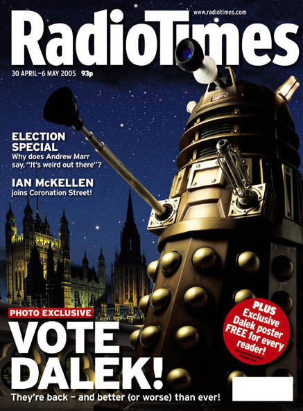 Here’s the famous ‘Vote Dalek’ cover from 2005, which a few years later was voted by the PPA to be The Greatest British Magazine Cover Of All Time. If I recall, there was some story about Shem having to stop traffic on Westminster Bridge, in order to get the Dalek perfectly framed, but I’m sure he’ll correct me if I’m wrong.
So what of IPC’s TV Times? Well, like Radio Times, it’s a proper brand. Both are premium priced, Radio Times is £1.40, TV Times £1.20 as opposed to budget TV titles 50p. In such a price sensitive market these are emotional purchases. Both have to offer more than the sum of their parts.
The BBC access enjoyed by Radio Times, and its links to a Great British Institution, are at the heart of its value. That’s why it can visualise its cover with just one picture. TV Times is a very different proposition, as its commercial TV heritage talks to a much more more populist approach. As a result, TV Times needs to offer maximum value within a premium wrap, much like the freeview channels that make up the core of its offering. This means that they have to build the cover with clearly separate stories, all with separate pictures, and yet keep it visually coherent and aesthetically pleasing.
As anyone who has ever attempted this will know, these are the hardest cover designs to perfect. Dale Walker is doing a great job in this space over at Woman, likewise Kirsty Harlow at Now and David Richardson at What’s On TV, whose cover I wrote about here a few months back. But for me, even allowing for the fact that I’ve worked closely with him on the brand, Art Director Steve Fawcett’s current work on TV Times is just brilliant. 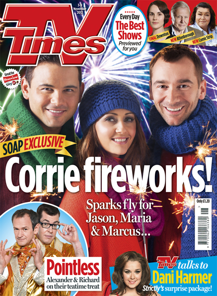
This is a newsstand firecracker. Four stories, six pictures, nine faces and a button. The splash picture is really tricky, made as it is of red, green, blue and purple. But with crisp colour control, clever design, and the right fonts (Gotham and Miller), the whole thing feels about as premium as a multi-coloured, many storied, mass market soap cover can get. All of which helped it to win IPC’s Cover Of The Month for November.
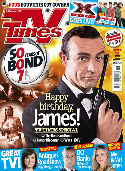 TV Times publishes split run covers too. Here’s its recent James Bond sequence, which again manages to feel super impactful, hold together as a piece of art, and yet still deliver five stories, nine pictures, thirteen faces and a button.
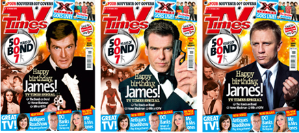 It’s brilliant work, and amazing value. The design feel effortless, but managing the sheer number of moving parts takes true skill.
But before we go, let’s have a look at how it used to be.
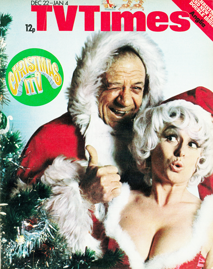 Here’s TV Times from sometime in the 70’s, when there was no competition on the newsstand. If you wanted to know what was on ITV that Christmas, you had no choice but to buy it. But you’d be happy to do so on the basis that ITV looked waaaaaaay more fun than anything Auntie might have to offer. Pure genius.
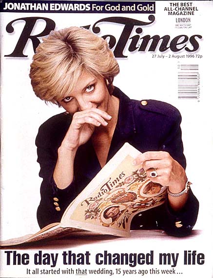 Likewise, this look-a-like Diana, from Radio Times in 1996. I have no idea what the story was about, but I can remember stopping the car, and rushing across the road to buy it, so amazed was I that Diana had done this shoot. She hadn’t of course, but the trademark position of her hand made it almost impossible to tell.
Love that old logo though. Loads better than the new one.
Update: Since posting, I’ve seen this really clever social media stunt here around the forthcoming Radio Times Christmas cover. There’s an excellent gallery of old Christmas covers too, well worth a look.