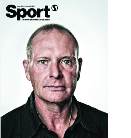
 Sport magazine picked up Cover of The Year at last night’s PPA awards in London, with this haunting portrait of Paul Gascoigne, taken by Jon Enoch.
But as Roy Greenslade asked earlier this week in The Guardian, how do you judge a cover by a cover? As he suggested, is it really is a case of comparing apples with oranges?
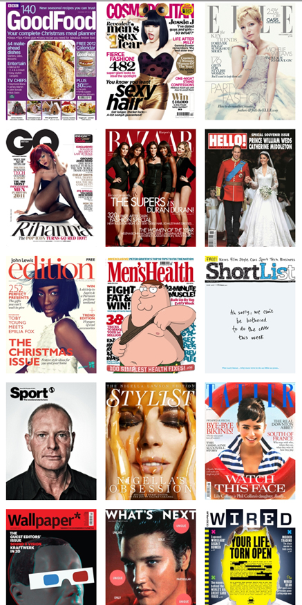
The PPA process was simple enough, make a shortlist of 15, and then decide by public vote. But that vote takes no account of the environment these covers were originally designed for. Some are newsstand titles – designed to fight for attention and your money. Others are produced to promote their sponsor’s brand. And then there is the third group of titles that are free, such as Sport, and just given away every week outside the tube.
All covers are pieces of commercial art. The question is how commercial does it need to be and what value is placed on it as that piece of art? The fact of the matter is that if Sport‘s cover were to be placed in a newsagent with an invitation to pay money for it, it would sell nothing of any consequence. I worked on the launch of Emap’s Total Sport back in the 90s, I’ve been there.
Failing to sell enough copies is not a luxury available to Cosmo and the rest of the newsstand titles in the shortlist, hence all the coverlines. Words are not the only way to describe value of course, but for titles that actually do want to shift units, readers must be reassured that it’s going to be worth the money.
To some extent, monthlies show value automatically, as they have a spine that talks to both quality and quantity. But for flimsier saddle-stitched weekly titles, coverlines tend to assume even more importance.
But enough of the theory, and back to the winning cover. The vote took place online, with all the covers arranged in a perfectly even playing field. So why did Sport win?
 This presentation is not dissimilar to that way covers are now displayed in Apple’s Newsstand. The techniques required to stand out in this PPA poll, have real implications for how we approach selling digital magazines online.
I believe we look at a cover for evidence of who we are. If we see ourselves or our fantasies reflected back, we’ll make a connection. That’s why eye contact is still so important. And that’s something Paul Gascoigne’s portrait delivers in spades, better than anything else here.
But after that, we have to look at the fact that there is no coverline, and no attempt to identify him. Many people will not recognise him. But that’s the point; if you do, (and most men over a certain age will), then not having his name lets the viewer understand that they are already on the inside of the story. They are part of the club.
There is a conspiratorial quality to all our relationships with celebrity. We make them, and then we break them, or in Paul’s case, they break themselves. Although it must be said that the no-coverline technique is usually reserved for people who have just died. But we’ll not go there just yet.
But the killer stroke is the texture of the photograph. Which seems to perfectly fit with what we know about the texture of his life. A magnificent footballer. Hero. Alcoholic. Wifebeater. ‘Friend’ of Raoul Moat. The picture seems to say that Paul knows all of this. He meets our gaze without flinching. It really is great work, and a fine cover as a result.

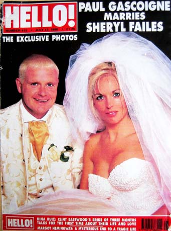
Our relationship with Gazza is a long and enduring one. For many years his wedding on the cover of Hello was its biggest ever selling issue. It may still be for all I know. Elvis aside, he is the most famous face in this shortlist. (Although since I made this post, my wife has reminded me that Rihanna is now the most famous person on the shortlist, so clearly, not many young women were involved in the voting)
But Elvis is not British, when push comes to shove, we’ll always go for someone, or something we can actually relate to. Which was demonstrated that last time the PPA ran a public vote to determine what was the Greatest British Magazine Cover of all time. That was won by the Radio Times, with it’s excellent ‘Vote Dalek’ cover.
The true takeaway here, is that we need to learn how to sell magazines in Apple’s newsstand, instead of just wedging them into the local WH Smith. The rules for creating cut-through and value are going to change. Much like the shift from LP cover design to that of CD covers, the smaller format is going to force us into cleaner, leaner positions. We are going to need new ways to prove value for money in this growing retail environment.
The runners-up in the PPA poll were Stylist and Wallpaper, again both very minimal designs with tremendous emphasis on the photograph. Publishers already make special subscriber issues, maybe we will need to rethink our newsstand covers and make special versions for Apple’s newsstand.
One thing remains certain. We will always need stories to back-up the promise, and we will always trust a brand better than a commodity. And they’re both things this industry is really good at generating.