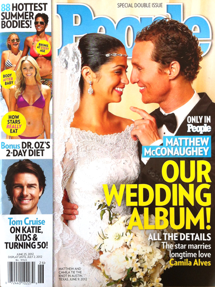
 The celebrity news weekly market is as tough in the US as here in the UK, but People still totally dominates it. It’s the world’s biggest magazine, over 2 million subs and another million on newsstand, or thereabouts. They’re really going for it at the moment, with one wedding or baby shoot exclusive after another. But this, the latest issue, is an absolute belter. Here are the five things that make it really work.
1. Trust. As with any brand, this is everything. But celebrity ‘news’ is so inherently untrustworthy, and the market weakness for spin so great, that sticking to the facts can be tough when compared to Perez and the tabs. But the fact remains, if you’ve read it in People, you know they haven’t made it up.
2. Access. This remains People’s strongest card. Celebrities trust People, they know it won’t stitch them up, so in return they let the brand in. Here, the McConaughy wedding picture is just fantastic. It feels like the truth, it lets the reader believe they are sharing a genuinely intimate moment, the finger gesture is just genius. And note the headline; it’s not ‘The Wedding’, it’s ‘Our Wedding’
This scoop is so good, it has pushed the exclusive Tom Cruise interview down to the foot of the cover. This is still an important component; aside from delivering more access, Tom covers off kids and family, and gives eye contact on the newsstand.
3. Bodies! By far the biggest part of the whole package is the top left body story. In the UK, many mags would splash on this, but here, although the second story, it’s given prime real estate, moving the logo over to the right at a consequence.
They’ve got the killer lines. ‘Body after baby’, ‘How the stars really eat’ and ‘Bikinis at every age’, all proven sellers. In the UK or Australia, these lines would be be massive, but with the usual risk of perceived overclaim. Here, they are really quiet, tiny even. But they are in the hottest of hot spots, and sitting on really hot pictures.
4. Colour. Unlike the rest of the market, People’s brand colour is blue, which can make for a relaxed, thoughtful presentation. That’s part of the brand, but not much help in the screaming bunfight of the newsweeklies.
So the key is how to manage the rest of the spectrum. The whole market pretty much uses a yellow splash, as no other colour pops as hard off a picture (5th colours are rarely seen in this market, due to the huge print runs). But where do you go after that?
The ’88 Summer bodies’ story doesn’t hold a lot of space, but is lifted by the yellow blobs. But the pink type upon them is handled with spectacular restraint. This is where the tension between selling the socks off the content, and ‘managing the brand’ is most acute. Get it wrong, and you risk making the whole package feel cheap. Given that this is People’s $4.99 double issue, that’s not a good idea.
Picking out ’88’, Bonus’ and ‘Tom Cruise’ in blue is an understated colour-way, not often seen in this market. It doesn’t leap like pink, but prevents the content feeling commoditised, and keeps it all on brand.
5. Diets. I don’t think I have ever seen a diet line on the cover of People before. But this isn’t any old diet story. Dr Oz is ‘one of America’s leading heart surgeons’ and the Oprah-approved star of a huge Emmy-winning TV show. And the story inside the magazine is genuinely amazing, in the way the best of American health and service content can be. Totally worth the price of admission on its own.
My only reservation is that I didn’t notice it straight away. That’s because it doesn’t have a picture. But as anyone who has ever attempted to visualise diet content in a small cover space knows, this is an almost impossible task. A plate of mung beans is not going to do it, which is why People, in its wisdom, has placed the line directly underneath the incredibly flat stomach of George Clooney’s girlfriend.