Into University, an award-winning charity devoted to social mobility.
Design and develop an interactive website to demonstrate the impact and value of the charity’s work through data visualisation.
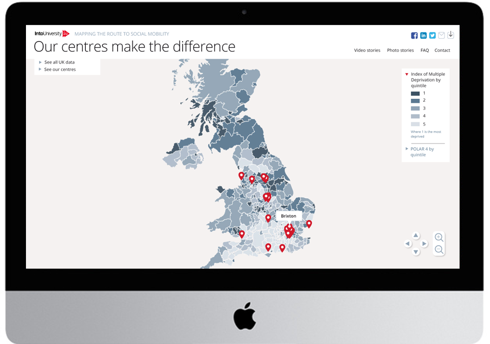
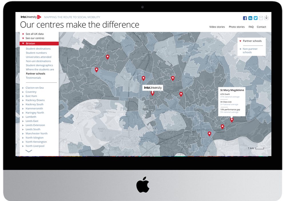
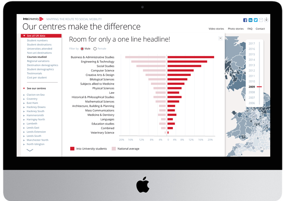
Partnering with data visualisation specialists Furthr, and developers Agency,Mai?, the design centred on an scalable, interactive map of the UK, showing areas of social deprivation down to postcode level.
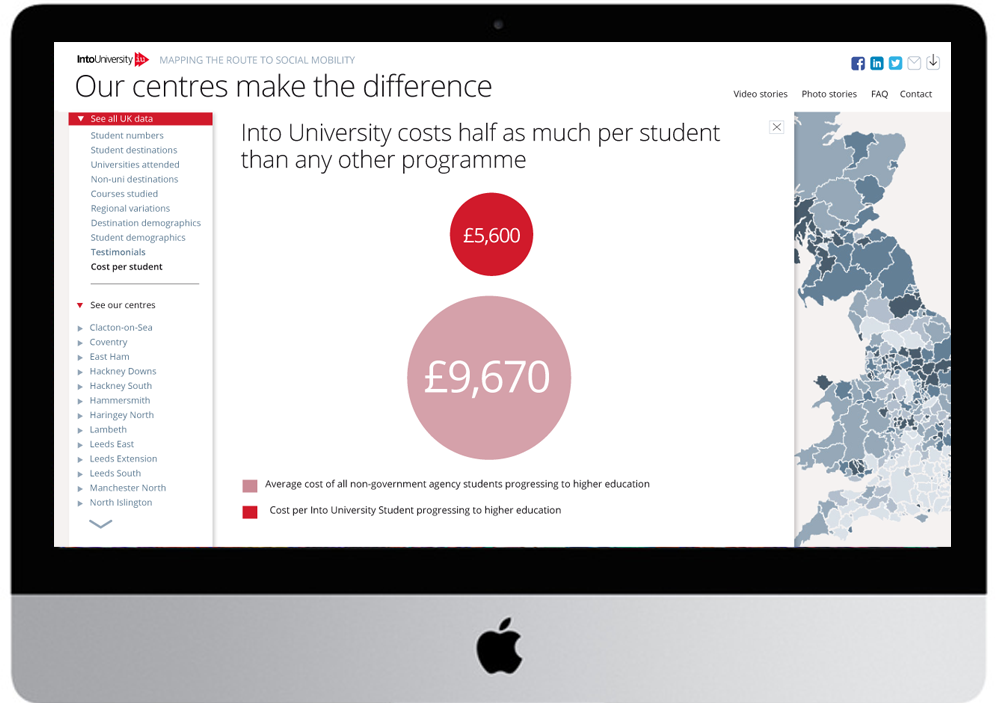
Into University’s success is underpinned by having physical centres in areas of the greatest need, so it was essential to contextualise their data with this geographical fact.
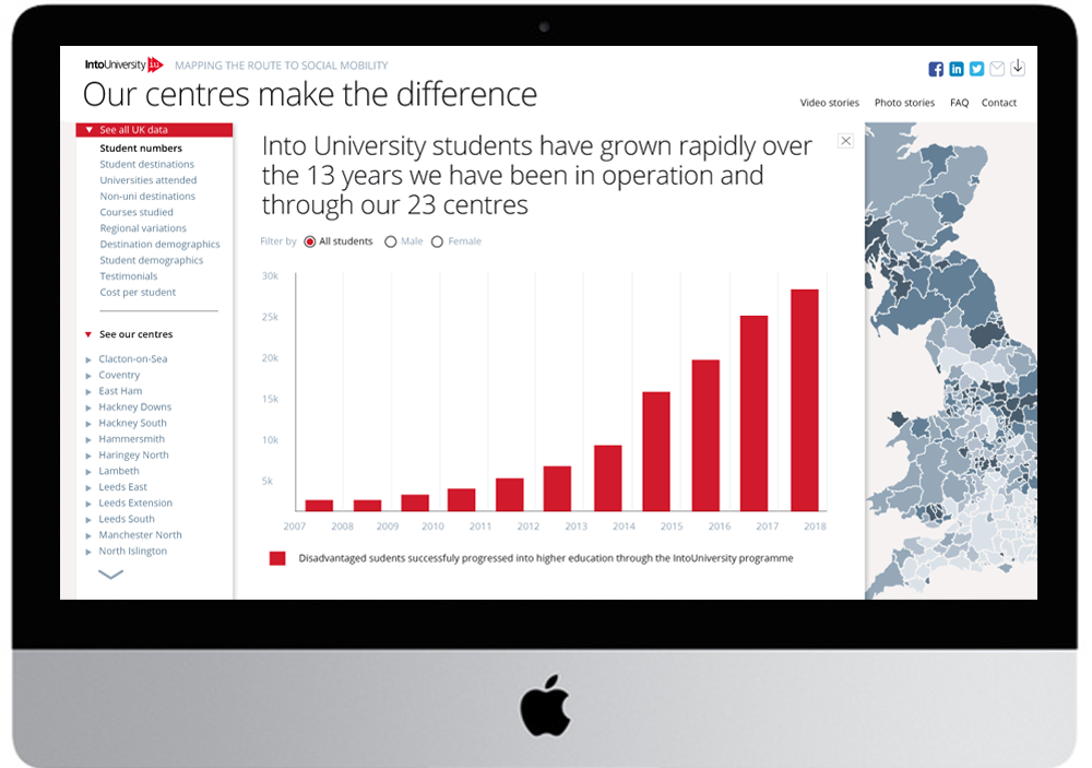
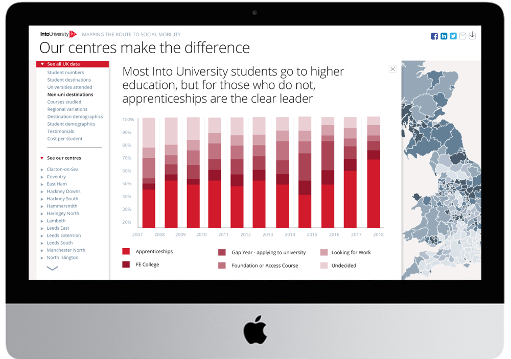
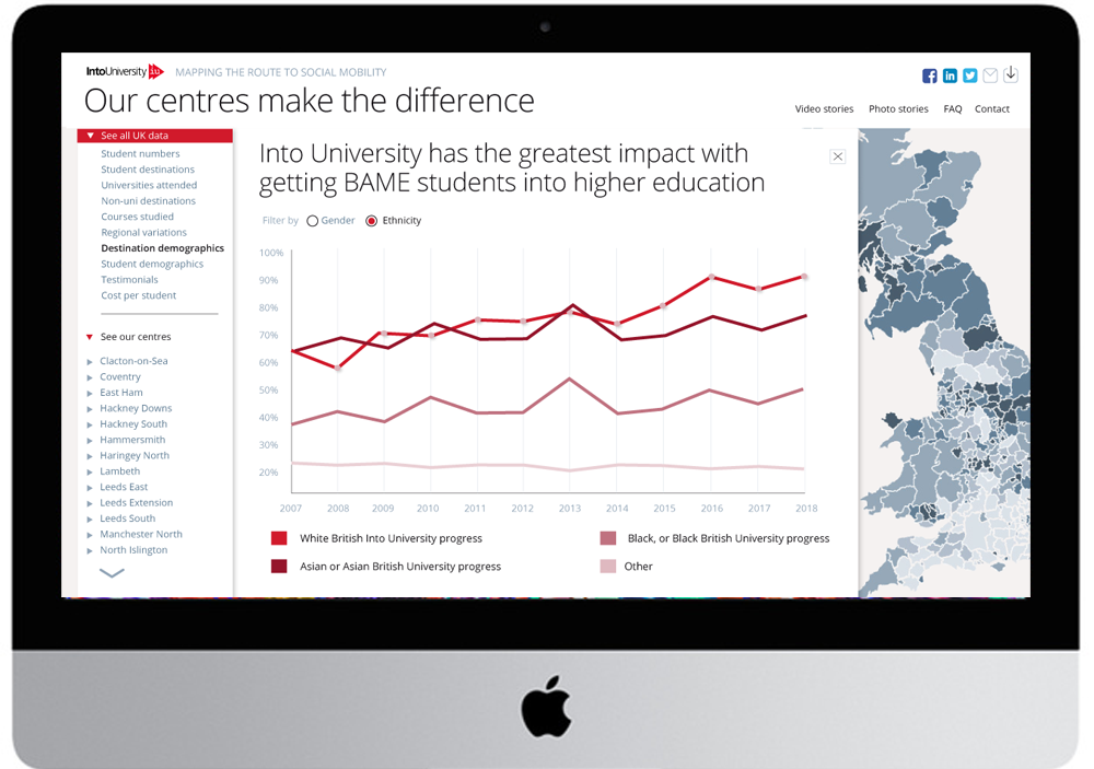
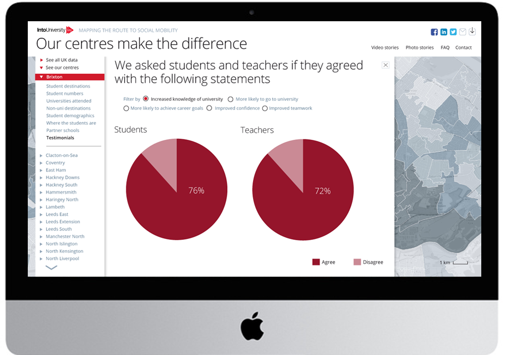
Then, every performance metric was visualised over the life of the centre. Users are able to access the data at local or national level and through a wide range of filters.
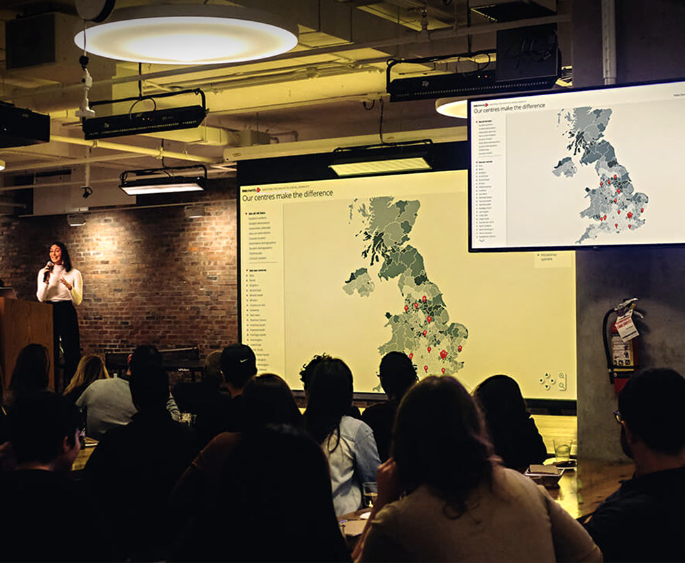
The new website was launched at Into University’s transformative data event at UBS’s Broadgate headquarters, where it was received to great acclaim.
At the launch, Chief Strategy Officer Dr Hugh Rayment-Pickard said: ‘To our knowledge, we are the first charity to have tried anything this ambitious’. Head of Fundraising John Bleasdale said ‘We’re just delighted with the response to this ground-breaking innovation’.