Incisive Media
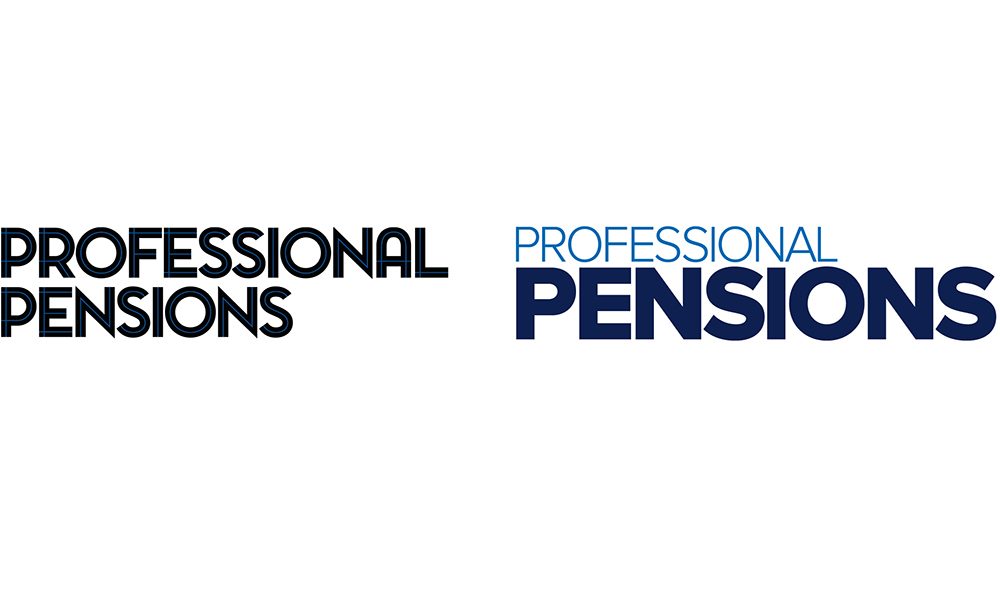
Move the brand into a premium position, ensure the new identity ingrates seamlessly across all platforms, change the frequency of the magazine from weekly to monthly.
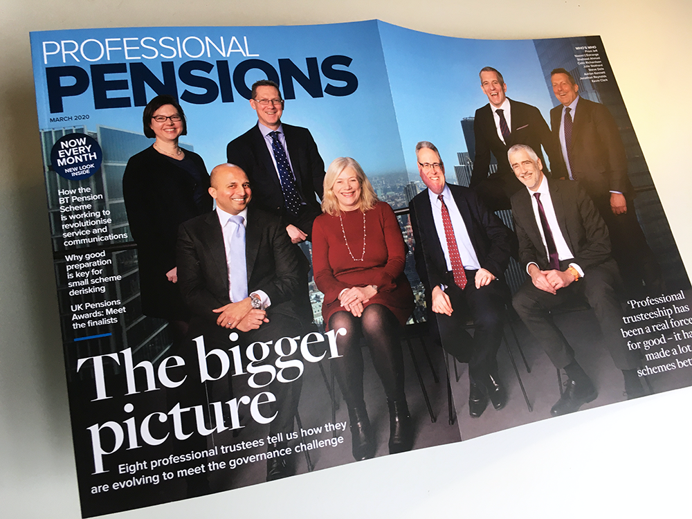
The launch marketing showcased the new logo, along with premium typography and quality photography. The art direction was clear – pensions are all about people, so people had to be on the cover in one form or another.
The first issue featured an exclusive roundtable with eight of the UK’s top pension trustees, shot in the Gherkin and designed into a gatefold – a first in this market and for the B2B sector as a whole.
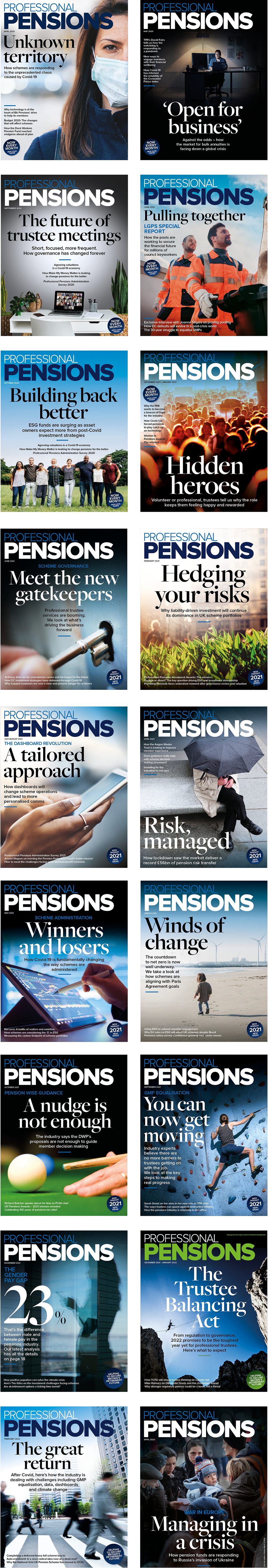
The redesign was a big hit, with advertising and audience engagement way up and hundreds of positive comments on Linkedin
But then came Covid which meant a whole new way of working. For the next two years, Cowles Media designed the cover for every issue, writing the splash, finding the pictures and presenting multiple options for the team to choose from.