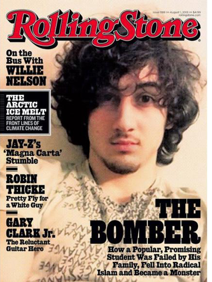
As an ex Art Director of Rolling Stone, I’ve been reading a lot about this week’s cover, which has created a shit-storm of accusations that they are glamourising an alleged killer.
The Guardian report that certain retailers will not stock it. Jezebel has a good round-up with lots of supporting visuals. The Huffington Post says they were right. Boston magazine says they were wrong. Bloggers far and wide are all busily casting theories, culminating with The New Yorker’s well made opinion:
‘This is an example of two of the ugly public outcomes of terrorism: hostility toward free expression, and to the collection and examination of factual evidence; and a kind of culture-wide self-censorship encouraged by tragedy, in which certain responses are deemed correct and anything else is dismissed as tasteless or out of bounds.’
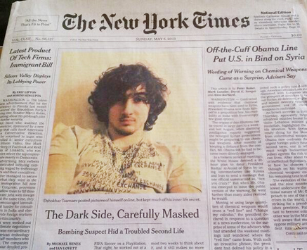 My view is that Rolling Stone are quite within their brand and their remit to write this story, and perfectly entitled to put this picture on the cover, just as many newspapers have done. Here’s the New York Times, by way of example.
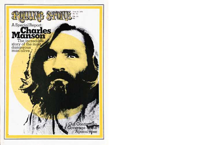 Where this has gone wrong is how the picture is perceived. When Rolling stone put serial killer Charles Manson on the cover back in the 70’s the magazine still had a newspaper format. Crucially, the logo did not go over the image, itself virtually an illustration. This meant critical distance was maintained, there was no endorsement, and no outrage (not that I can remember!).
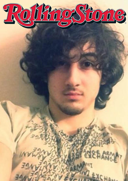 But put the logo over a glossy image and everything changes. To hell with what an editor might think, the public see this as invitation to admire the subject, to buy into the fantasy, to identify with the brand’s cover choice.
This is an extraordinary image for Rolling Stone to use, not because he looks like a Rock Star, but because it’s a selfie. Rolling Stone is legendary and rightly so for creating powerful identities on their cover. Here, they are doing nothing more than reflecting back to us the vanity of a young man’s narcissism, complete with his Armani Exchange T-shirt.
Regardless of the quality of the reporting inside, the use of such an image was always going to be the story. Particularly for a title with such a history of putting long-haired hippies on the cover and asking us to love them.
Already, thousands of people are firmly of the belief that Dzhokhar could never have committed the crimes he is accused of, purely because of the way he looks in this image. We are such a visual society that we are willing to ignore any amount of hard evidence in favour of a good haircut.
My complaint lies with the words ‘The Bomber’. Notwithstanding that he is innocent until proven guilty, and that any editor in the UK would never get such a headline through their lawyer (read Roy Greenslade on the matter here), it’s this unthinking label that causes the problem. Unlike the New York Times headline (The dark side, carefully masked), ‘The Bomber’ does not comment on the image.
Without the words, we don’t really know what to think. The picture asks a good question, but it’s up to the editors to let us understand what this picture really means. Are we: ‘Looking at the face of American youth’ Or is it: ‘What this picture says about America today’. Who knows, and of course, very easy to say with hindsight.
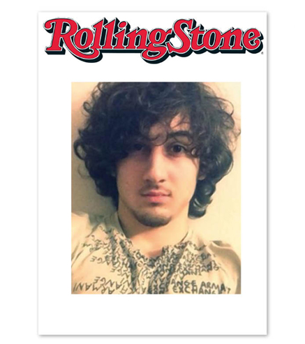 Another route to making this cover work would be a layout that detaches the image from the logo. At this point there is no explicit editorial endorsement of the image. It’s the technique that has allowed Time magazine to put any number of mass murderers on its covers over the years.
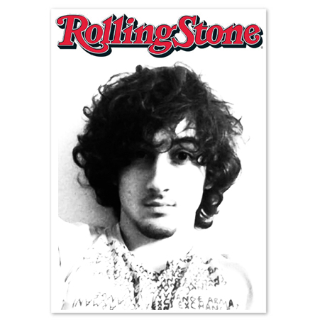 Or of course, they could go the Manson route and abstract the image, so that it no longer becomes a depiction of reality. Rolling Stone would still have a controversial cover, they might still be accused of glamourising terrorism, but perhaps they could have avoided the Boycott Rolling Stone facebook page, currently at 142k likes and rising at the rate of 2000 an hour.
Update: since this post was made, Rolling Stone reports that this issue doubled it’s newsstand sale.