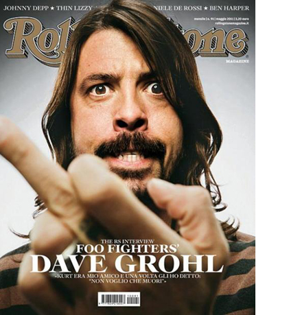
 This is a recent cover of Rolling Stone Italia, which I found on the excellent Magazine Wall tumblr site courtesy of Magculture. It’s everything you’d expect a cover of Rolling Stone to be: powerful, memorable, a genuine event. It’s hard to make work this good look so effortless. I should know, I was Art Director of Rolling Stone in America in 2002-4, and would have been delighted to have done a cover this strong.
So why is this European cover better than the American? Well, if anybody tells you different, don’t believe them, because size really does matter.
The original Rolling Stone format wasn’t unique, it was shared by ESPN, and before that Premiere at launch. But these were the only magazines that had this fabulous, widescreen format, and it was Rolling Stone that made it famous. The title stood apart from everything else out there, it conferred a sense of difference, a feeling of being special.
But there were problems. There was only one press in America that could print it, and it was wearing out fast. The print quality was deteriorating, it couldn’t incorporate inserts and it wasn’t going to be replaced. So the printers had Jann Wenner over a barrel when it came to the price. In addition, the subscriber postal charges were sky high for such a big envelope, while on newsstand, it had to be sold on the plinth, not in the racks, making it hard to find.
So, several years after I left, they reduced the size, as reported in the New York Times. And then swapped one kind of pain for another. Because now the proportions are quite different. By comparison, the mag is now tall and thin. Which significantly diminishes the logo, one of the finest media brand marks of all time.
The logo may be powerful, but it’s also relatively long and thin. It needs to be used on a wider format to have any chance of being seen, or imposing itself on its subjects. A wider format allows the logo to go over the subject due to its shallow height. Equally, if the logo goes behind the image, then there’s plenty left to see due to the extra width. The subject of logo over or under the picture is worth a post in its own right, but that aside, what does Rolling Stone look like today?
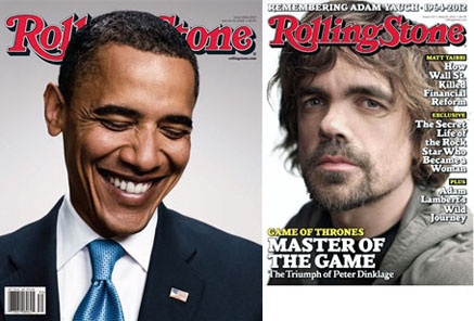
Well, this comparison is unfair in many ways, but totally accurate when it comes to the actual sizes of old and new formats.
The Obama cover, quite rightly, won the ASME cover of the year in 2009. It’s the newsstand version, and as such possibly my favourite cover of all time; one of the last to be produced on the old format. On the right is the current issue, featuring Peter Drinklage. There’s nothing really wrong with it, apart from the obsession with the Parkinson font, and weird use of yellow on black. But there is no way this is any kind of event. It will not win prizes, it will not be remembered. The creative team on Rolling Stone is among the best I have ever worked with, so whatever irritation I might have with the format, their pain must be a hundred times greater.

