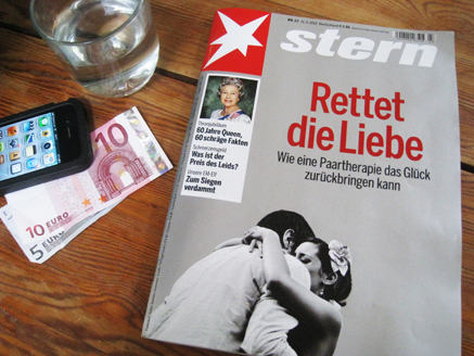
 Here is the latest issue of Stern, which I bought over the weekend in a Berlin U-Bahn station. The cover story (Rescue The Love) is all about couples therapy, which seems both urgent and appropriate given the way Germany and France are behaving toward each other right now. And even more so given that Berlin itself is a living monument to the last time Europe tore itself apart. The whole city is completely tattooed with its experience. Endless graffiti, WWII bullet holes, and of course the museums, the memorials and The Wall.
How the German psyche parlays into their love of print is beyond the scope of this post, but it remains a fact that Germany still has a fascination with the stuff. Bars are fully stocked with magazines, and people actually sit down to read both them and newspapers, as opposed to endlessly scrolling their phones.
Stern is possibly Germany’s best magazine, and certainly one of the world’s benchmarks for quality photojournalism. The circulation is around 300k each week, it has 128 pages and seems to have plenty of ads. At 3.50 euros it isn’t cheap, but it is unexpectedly rewarding. There is a look and feel that is unmistakably Continental. Gravure printing, big pictures, deep text and a design that feels both relaxed yet highly considered.
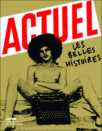
It was back in the 80s when I first discovered European news magazines, in particular the legendary French news monthly, Actuel. I couldn’t read a word of it, but I just loved the way they threw down the perfectly cropped pictures, and laid out the type with a real sense of purpose. Fact fans may care to note that the design of the very first issue of The Face, done by the legendary Steve Bush, is a virtual photocopy of Paris Match, the other great European newsweekly.
Unlike Europe, the UK has never had a strong news magazine culture, due to being so well served by quality Sunday paper supplements. It’s easy to forget, but in their heyday, The Sunday Times and Observer magazines were powerful, must-see titles.

So what can we learn from Stern today?
Well, trust in the brand is still the number one reason to buy. The logo is a highly recognisable shape, white out of a conventional tabloid red corner block. But then, there is the counter intuitive play of making the word Stern sit on the picture, as if it were a huge coverline. The overall effect is that of both a weekly and a monthly. A unique combination, as far as I know.
The layout is decisive. The secondary stories are clearly boxed off just under the logo, so plenty of value there. They don’t always use a drop-in picture, but her her Madge does supply some handy eye contact. After that, the entire cover is devoted to the splash. It’s taut, but emotional too, sitting on a solid panel of 5th colour silver. The whole thing feels important and special. In another unconventional move, the barcode is above the logo, which doesn’t mess up the design, but does leave the cover story completely open. Very smart.
Inside, the whole issue feels fantastic value. Much like the New Yorker wrapped up in a full colour Picture Post. It’s a really well paced, intelligent handling of a magazine flatplan. Here are just three of the spreads.
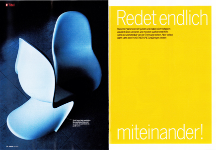 This is the cover story on couples therapy. A tough subject to illustrate, and even harder to get readers to engage with. But the clever use of designer chairs, sensitive art direction and sophisticated layout clearly works.
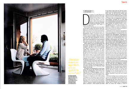 The second spread is equally good. The typography is always talking to the photo, but still directs the page. Red slug top right, highly visible credits, pull quote keying back to the opener and an easily read caption. The grid is magnificent. Think Wim Crouwel, Simon Esterson and Mark Porter.
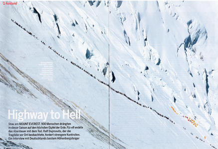 And this is the traffic jam on Everest of a few weeks ago. I’d read the story of two hundred climbers attempting to summit in one day, but I hadn’t seen this particular shot. And I certainly hadn’t seen AC/DC used as the headline! Quite brilliant.