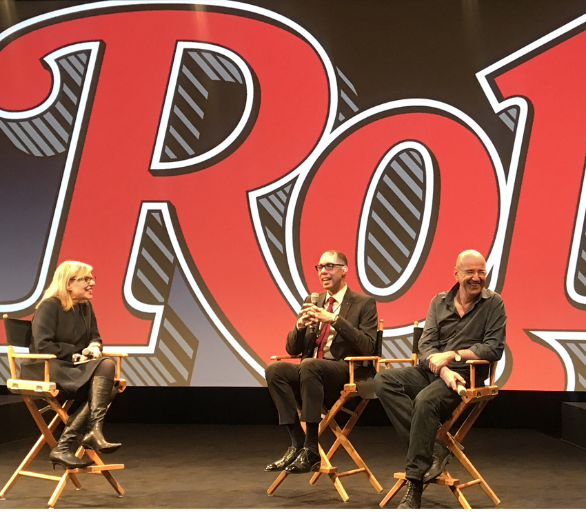
 This year I was honored to be part The Art of Rolling Stone conference in New York City. I was art director for just a couple of years, but along with Rolling Stone’s first art director to its current one, we will shared our stories in the making of a legend.
Organised by Type magazine, the timing of this event has much to do with the recent sale of the title, along with the new biography of Jann Wenner, its controversial editor and founder.
Everyone has a different point of view on what, exactly, makes Rolling Stone great.
So here’s mine, along with the story of how my team and I designed the title.
 The hidden power behind the design of Rolling Stone is the Oxford rule that goes around every single page. Such a rule is like no other. It’s a rule around a rule. It’s like saying the page frame itself is worth putting in a frame.
Much like Rolling Stone’s owner Jann Wenner, it’s a gesture of control, a mark to say that this is the last word on the matter, almost an attempt to stop time itself. It reminds me of Pete Townshend’s smashed guitar sealed up in resin, hanging in a box (another frame) right by the magazine’s entrance.
 Taking that Wild Mercury Sound, and then stuffing it back in the bottle.
It may be a sort of design narcissism, but there are two killer benefits to the Oxford rule. Firstly, it directly reflects the design DNA of the Rolling Stone logo itself. Which means that the rule is the logo, and vice-versa. It’s like putting the logo around every page – a branding masterstroke.
Secondly, the rule was so strong, and so on-brand, that inside it YOU COULD DO WHATEVER THE FUCK YOU LIKED, and it would still look like Rolling Stone.
Enter Fred Woodward, who frankly, did just that.
It’s impossible to overstate the man’s genius. Here’s an excellent video just made to celebrate Fred’s latest typographic honour, well worth a few minutes of your time, and much more eloquent than anything I could write here. Do take a look.
So, after Fred left for GQ, I got lucky and got his job. As much to do with my good work on UK’s Mojo as anything else, but given that Maxim and Blender were tearing up the US Newsstand, Jann might just have fancied a European in the chair.
So how the hell do you follow Fred?
I approached this impossible task in two different ways. Firstly, I hired a powerful art team in Kory Kennedy, Devin Pedzwater and Matthew Ball.
I then looked at the use of type from these three principles.
- To take advantage of the format – the trim size, the Oxford rule, the logo, all the unique fixtures and fittings established over many years.
- To build on Fred Woodward’s astonishing typographic creativity and eclecticism.
- To make the title more readable.
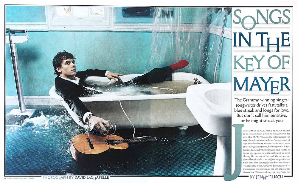 The format of Rolling Stone was incredible. The unusual widescreen proportion and big page size threw conventional page proportion work right out the window, as seen in this fine John Mayer design by Devin and Kory (Photo by David Lachapelle).
Spreads were enormous. You could use very small headlines and they would still have an impact. On the cover, the widescreen logo was in perfect relationship to the paper size, giving the designer a canvas to work with no other title could get near.
Long after I left, the title went to a smaller, more vertical format. Here’s my detailed post that unpacks more about the impact of that decision. Although here’s another story that shows that even though the cover was smaller, Design Director Joe Hutchinson and Creative Director Jodi Peckman could still make it amazing.
I gave Kory and Devin most of the cover features to design. They’d both grown up absorbing Fred’s aesthetic, so I figured they’d rise to the challenge of doing work that carried on his exceptional typographic standards. And so they did, knocking out dozens of features with the same level of vision, craft and attention to detail that Fred’s team of Gail Anderson, Ken DeLago and Siung Tjia delivered.
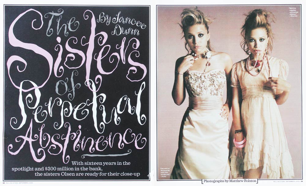
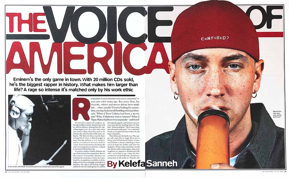
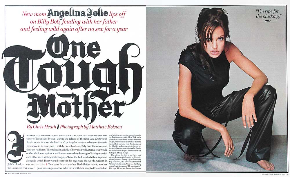
Due to the effect of the Oxford rule, we had a pretty wide range of fonts to play with, but for a while, I was particularly enamoured with Storm Type, a progressive Czechoslovakian foundry. Their fonts were cool, but challenging to use well. Kory, Devin and Matthew did amazing work with them, but on reflection, my trying to wedge a Raygun level of modernity inside the Oxford was perhaps a bridge too far. (Angelina Jolie and Olsens by Matthew Rolston, layouts by Kory Kennedy, who also designed the Hendrix cover with me)
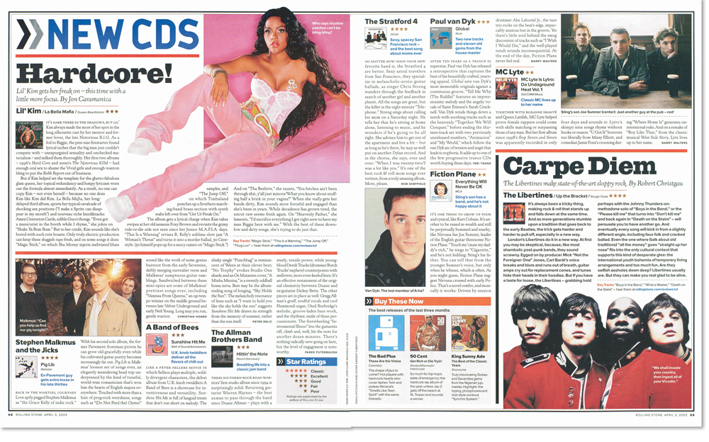
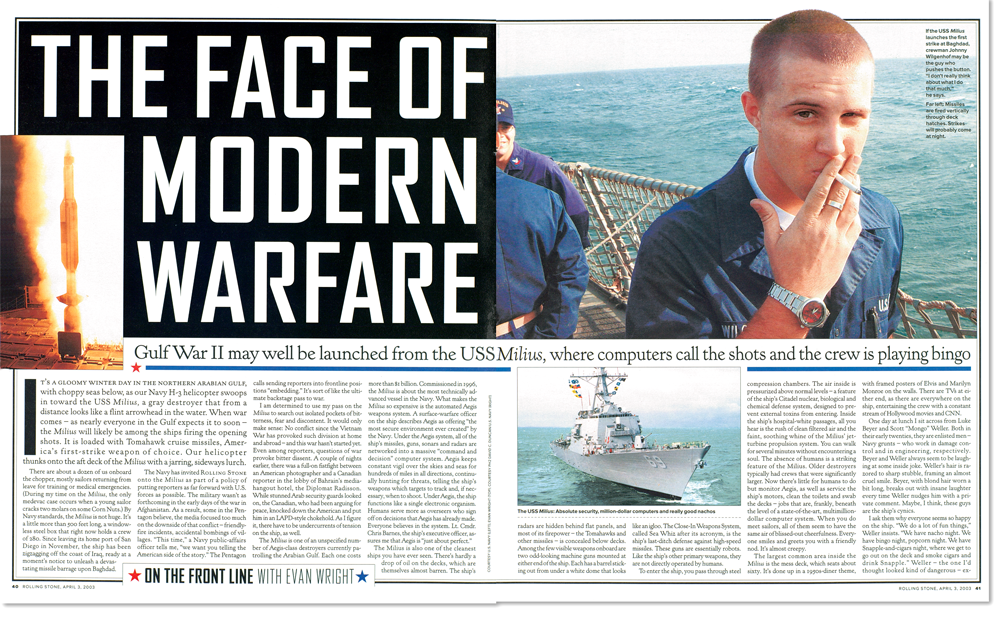 Along with Matthew, I tended to design the news features. These often needed several documentary images to tell the tale – I liked being able to leverage the visual storytelling style of the great news mags like Stern, Actuel and Paris Match. But here the Oxford rule wasn’t so helpful, as it prevented full-bleed images, a central element to that fast-paced aesthetic.
On most of the features, we all tried to get text on the opener. That looks less good on blog posts like this, but increases reader engagement and gives more for hooks on the following pages.
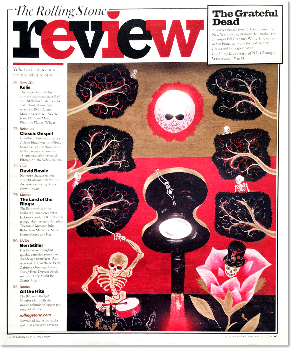 I then concentrated on giving the departments some love. These pages were often neglected in favour of feature spreads that might win awards, but at the time I joined, our research showed that readers were spending just 15 minutes with the title, as opposed to 60 with a copy of Maxim.
 In Rolling Stone, the departments were more than 50% of the book, so I wanted to make these pages much more compelling and engaging.
 My strategy was to use very modern fonts like Metsys for section logos, and team them with traditional Giza headlines. Bigger section heads were set in Farao with overlapping letters – a traditional Rolling Stone gesture. Layout-wise, lots of attention was paid to entry points and box-outs.
 I brought in Proxima as the sans font throughout. We used it for news headlines for a while, but there was no condensed version at that time, so we eventually swapped it out for Futura. That wasn’t entirely satisfactory, so we then changed to Giza, which was much better.
However, Mark Simonsen, the designer of Proxima, noticed my use of his font, and was subsequently inspired to draw the whole Proxima Nova family, now one of the world’s best and most successful font families. Here’s my story about that font, and Marks note on its use in Rolling Stone.
 Finally, I changed the text face. When I arrived, it felt a bit antique – very classic, but small and hard to read. It took about a week of testing different options and sizes, but eventually I settled on New Kennerley. That worked out well, it was still bang on brand and didn’t impact the word count, but it was smoother to look at and much easier to read.
Then there was the little matter of the cover.
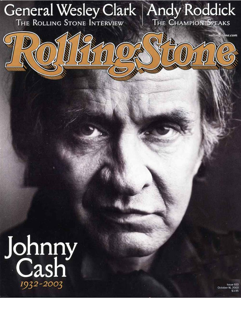
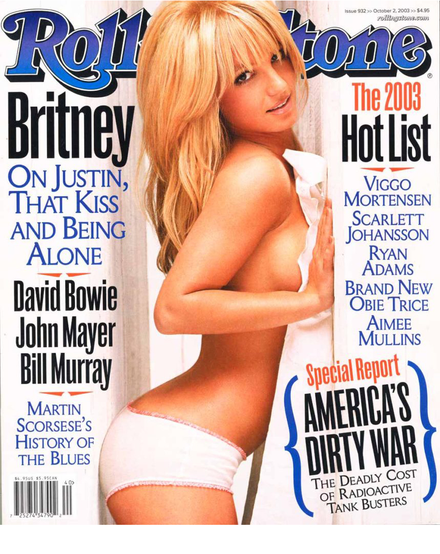
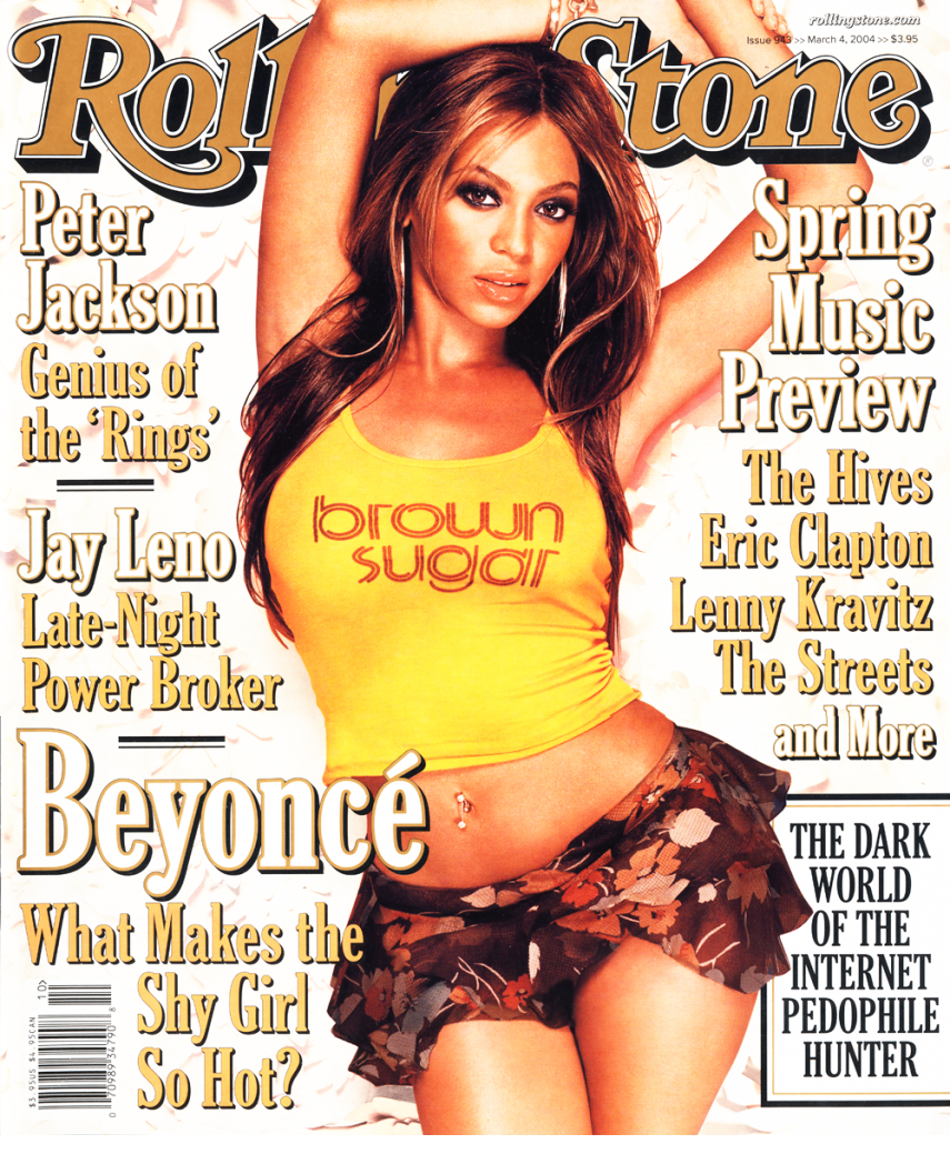
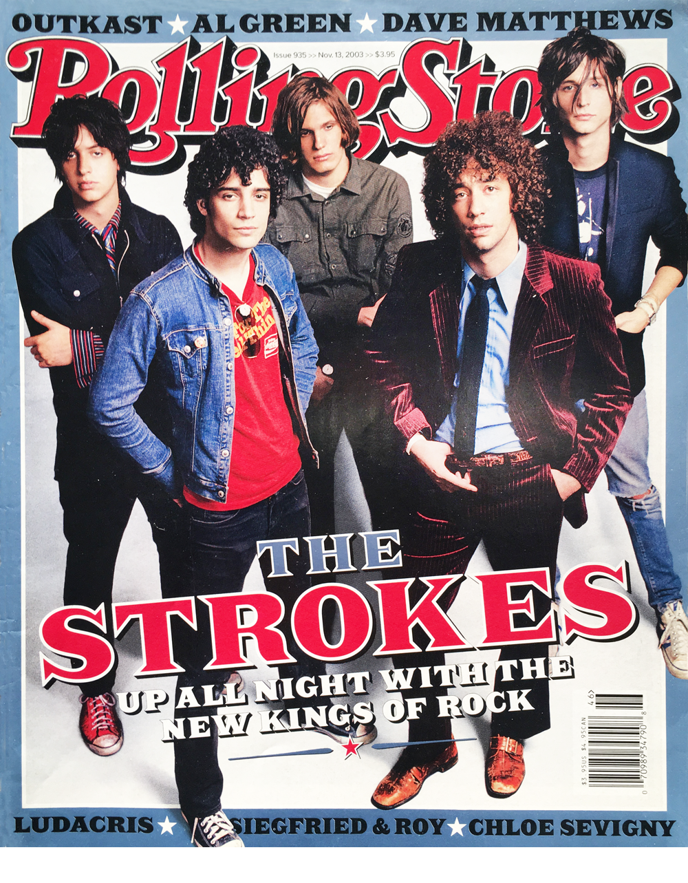 Here is where editorial direction, marketing, celebrity access and other business considerations all intersect. Given the bun fight this often produces, using the right font becomes even more of a demanding decision. (Above: Strokes by Max Vadukal. Below: Beyoncé by Ruven Afanador, Johnny Cash by Mmark Seliger, Britney by Matthew Rolston)
![]()
 Covers are public property, this where the audience truly gets to vote. They either buy you or they don’t. Post-match analysis is interesting (here’s my view of the controversial Boston Bomber cover), but the work will always end up speaking for itself, both good and bad.
I was at Rolling Stone for just over a couple of years, around 60 covers in all. But my experience was pretty much a game of two halves.
The first was all about me attempting to impose a new aesthetic into the frame – contemporary fonts merged with a more newsstand approach. And the results were mixed, I think it’s fair to say.
 But the second half was better. This is where I realised that you’ve got to work with what you’ve got. And if that’s a classic piece of Americana, so be it. I started using more traditional mid-west fonts, more drop shadows and generally stopped fighting with it. The work was stronger and I was happier.
You just can’t mess with an Oxford rule.
Or for that matter, Jann Wenner.